The course has been an enriching experience altogether. I have learnt a lot from the past 3 projects and have gained more insight into the other approaches that I can take in designing spaces.
A design site with a real site has its strengths, weaknesses, opportunities and threats (SWOTs). If properly analysed and thought over, the challenges could be exchanged into good design strategies instead.
Time management was a crucial aspect in the last project. There were much to do within very little time. There were readings to be done too in accordance to my narrative. I was much aware of the fact that my narrative that emphasizes human being meant a large phase that needs to be covered.
Nevertheless, things are learnt in the design process and also in the thinking process. Efforts and money invested in Design Studio will surely not come to waste, at least. I am now more committed into understanding more about architecture and learning from my seniors, my coursemates, and my juniors to extend my level of awareness and my degree of knowledge.
Tuesday, June 15, 2010
Final Submission
1. Site analysis

2. Precedent Studies I
3. Precedent Studies II
4. Narrative and Parti
5. Chosen Artists

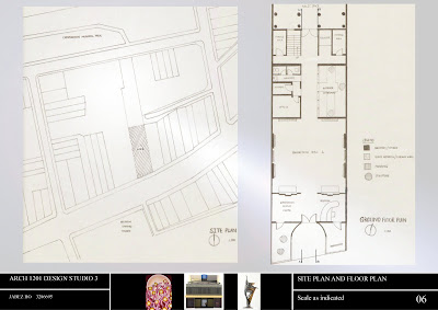
6. Site Plan and Floor Plan
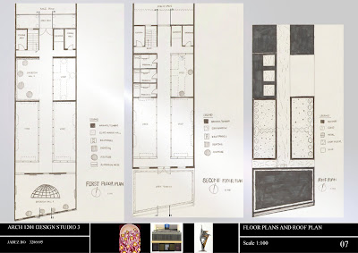
7. Floor Plans and Roof Plan
8. Sections

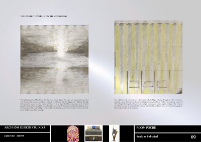
9. Room poche and elevation
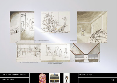
10. Perspectives
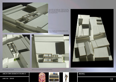
11. Model Part I
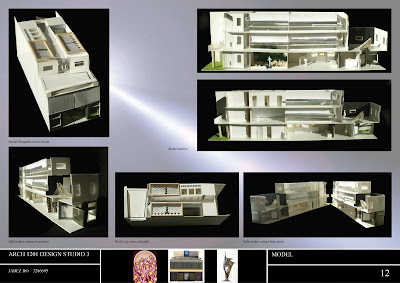
12. Model Part II
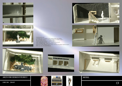
13. Model Part III
14. Talk on Ideas
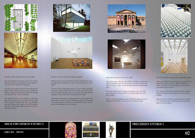
It's always good to share things that led me during the design process. Without the slightest doubt, the lectures that Xing Ruan gave on museums were a great help for me. I remembered him comparing IM Pei's Eastern Wing National Gallery and Frank Gehry's American Centre. Both were artworks of display, but the major difference lies in the organizational pattern. In Pei's builing, one can have a better sense of circulation and direction. An art gallery should not make one wonder where he/she is while inside, therefore an art gallery should have proper signs that indicate the presence of a room, a struture, an artwork etc.
I visited the Art Gallery of NSW and the Contemporary Art Museum to see how people have designed large scale art galleries. The NSW Art Gallery is one that focused on centrality - a main axis with side spaces to look at artworks. The Contemporary Museum of Art contains spaces that are segmented to define a certain artwork theme. The mezzanine level offers a different height of view which is quite interesting.
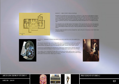
As I conducted site analysis and solar analysis, I realized that light is becoming a more and more interesting element of design that needs to be included in my design. Project 1 and Project 2 had a dip in the suggestion of light, I would like to take it further in Project 3 by 'diving' into light. After all, light is the giver of all presences.
Light is not only an element of architecture, it also suggests condition of a space - dark, medium or bright and also suggests the activities or happenings inside a certain space. Therefore, direct sunlight, diffused sunlight and little sunlight are to define the different spaces in my design. For example, exhibition hall 1 has a 3D-like organic roof which has certain gaps that allow light to come in through with that shape. Controlled sunlight that passes through glazed windows then hits the surrounding metal sheets which would be reflected onto the courtyard.
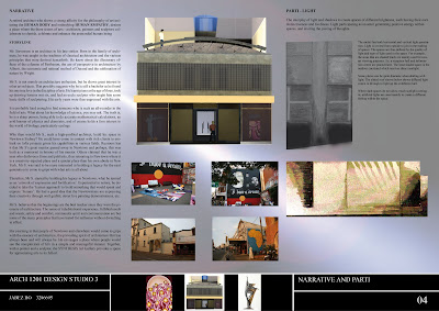
Based on the narrative, the human being is seen as the core idea of the art gallery, including the artworks displayed. The design of the art gallery focuses on two major parts of the human being - physicality/corporeality and non-physicality.
Physicality, there would be centrality, six-directional and synaesthesia aspects. Centrality always suggest something that is put on a sense of importance. The central walkway is an attention grabber with its end another door that is often illuminated. It also makes one feel significant as one positioned on the focus point of a space. Six-directional approach is a vital consideration involving up-down, front-back, left-right movement of the body and especially the eyes. The eyes as the main receptacle of artworks are challenged to view artworks at different heights, different angles and number of times. There is therefore an evaluation speaking of quality and quantity. Synaesthesia is another important occurence. This blending of senses increases the experiential qualities of the art gallery. For example, the thinking eyes, the touching heart, the feeling ears and the speaking ears. these are the happenings as one concentrates and analyzes the artworks.
The non-physicality aspect fouses on the mind and emotions of visitors. My visits to Newtown told me that King Street is indeed a busy place, but it told me more than this fact. I sat down sipping tea in a coffee shop, and I can still feel the hecticness of King Street just punching through the doors and windows of the shop. It is certainly undesirable in an art gallery when you desire people to be focused and immersed in the world of arts.
Dealing with this aspect of mind and emotions, I have dealt with three aspects, namely transition, empathy and communication. The art gallery maintains the face layer of the shop fronts of King Street, but it has a ground level entry that is recessed. Therefore, the shop tries to differentiate itself from other shops by having this recessed entry, one that would slow people down as they approach from the footpath. It is also a space which can stimulate curiosity due to it's difference, which is a good one. The transition through spaces are made as slow as possible. The art gallery does not play psychologically by making one feel detached from reality, as if in another space, but the art gallery has moments of pausation where one would take the opportunity to stay and analyze. Glass balustrades are included on first and second level to have visitors revisit certain spaces that may strike another tune in the mind.
The empathetic nature of the art gallery is seen in the position of the artwork in the type of rooms. For example, a sculpture in the courtyard, a sculpture in the glass window shop front and a sculpture in a dark exhibition room has different connotations, thus giving people different feeling when they view sculptures.
Communication with artworks and other visitors is another vital human being consideration. The art gallery is not silent place, it involves exchange of ideas. If one could picture the artwork which is visual perhaps interpreted into words when one tries to explain what he/she feels. The different leveling of spaces allows one to look and observe what other people are doing in response to what they see. Subconscious communication takes place in the art gallery.

2. Precedent Studies I

3. Precedent Studies II

4. Narrative and Parti

5. Chosen Artists

6. Site Plan and Floor Plan

7. Floor Plans and Roof Plan

8. Sections

9. Room poche and elevation

10. Perspectives

11. Model Part I

12. Model Part II

13. Model Part III

14. Talk on Ideas
It's always good to share things that led me during the design process. Without the slightest doubt, the lectures that Xing Ruan gave on museums were a great help for me. I remembered him comparing IM Pei's Eastern Wing National Gallery and Frank Gehry's American Centre. Both were artworks of display, but the major difference lies in the organizational pattern. In Pei's builing, one can have a better sense of circulation and direction. An art gallery should not make one wonder where he/she is while inside, therefore an art gallery should have proper signs that indicate the presence of a room, a struture, an artwork etc.
I visited the Art Gallery of NSW and the Contemporary Art Museum to see how people have designed large scale art galleries. The NSW Art Gallery is one that focused on centrality - a main axis with side spaces to look at artworks. The Contemporary Museum of Art contains spaces that are segmented to define a certain artwork theme. The mezzanine level offers a different height of view which is quite interesting.
As I conducted site analysis and solar analysis, I realized that light is becoming a more and more interesting element of design that needs to be included in my design. Project 1 and Project 2 had a dip in the suggestion of light, I would like to take it further in Project 3 by 'diving' into light. After all, light is the giver of all presences.
Light is not only an element of architecture, it also suggests condition of a space - dark, medium or bright and also suggests the activities or happenings inside a certain space. Therefore, direct sunlight, diffused sunlight and little sunlight are to define the different spaces in my design. For example, exhibition hall 1 has a 3D-like organic roof which has certain gaps that allow light to come in through with that shape. Controlled sunlight that passes through glazed windows then hits the surrounding metal sheets which would be reflected onto the courtyard.
Based on the narrative, the human being is seen as the core idea of the art gallery, including the artworks displayed. The design of the art gallery focuses on two major parts of the human being - physicality/corporeality and non-physicality.
Physicality, there would be centrality, six-directional and synaesthesia aspects. Centrality always suggest something that is put on a sense of importance. The central walkway is an attention grabber with its end another door that is often illuminated. It also makes one feel significant as one positioned on the focus point of a space. Six-directional approach is a vital consideration involving up-down, front-back, left-right movement of the body and especially the eyes. The eyes as the main receptacle of artworks are challenged to view artworks at different heights, different angles and number of times. There is therefore an evaluation speaking of quality and quantity. Synaesthesia is another important occurence. This blending of senses increases the experiential qualities of the art gallery. For example, the thinking eyes, the touching heart, the feeling ears and the speaking ears. these are the happenings as one concentrates and analyzes the artworks.
The non-physicality aspect fouses on the mind and emotions of visitors. My visits to Newtown told me that King Street is indeed a busy place, but it told me more than this fact. I sat down sipping tea in a coffee shop, and I can still feel the hecticness of King Street just punching through the doors and windows of the shop. It is certainly undesirable in an art gallery when you desire people to be focused and immersed in the world of arts.
Dealing with this aspect of mind and emotions, I have dealt with three aspects, namely transition, empathy and communication. The art gallery maintains the face layer of the shop fronts of King Street, but it has a ground level entry that is recessed. Therefore, the shop tries to differentiate itself from other shops by having this recessed entry, one that would slow people down as they approach from the footpath. It is also a space which can stimulate curiosity due to it's difference, which is a good one. The transition through spaces are made as slow as possible. The art gallery does not play psychologically by making one feel detached from reality, as if in another space, but the art gallery has moments of pausation where one would take the opportunity to stay and analyze. Glass balustrades are included on first and second level to have visitors revisit certain spaces that may strike another tune in the mind.
The empathetic nature of the art gallery is seen in the position of the artwork in the type of rooms. For example, a sculpture in the courtyard, a sculpture in the glass window shop front and a sculpture in a dark exhibition room has different connotations, thus giving people different feeling when they view sculptures.
Communication with artworks and other visitors is another vital human being consideration. The art gallery is not silent place, it involves exchange of ideas. If one could picture the artwork which is visual perhaps interpreted into words when one tries to explain what he/she feels. The different leveling of spaces allows one to look and observe what other people are doing in response to what they see. Subconscious communication takes place in the art gallery.
Friday, June 4, 2010
Organization of Spaces
The parti for the art gallery is formulated as below:
The interplay of light and shadow to create spaces of different brightness, each having their own distinctiveness and liveliness. Light participating as an actor generating positive energy within spaces, and inviting the joining of thoughts.
The organization of space is very much influenced by the movement of light. Light not only determines the spaces, but also lead us through, and inspires us by illuminating the mind.
Therefore, I created a long walkway in the middle. It is supposed to cut through the model as the light cuts through from the rear to the front. It is a journey to be undertaken by passing through series of spaces with different light intensity.
I thought of spaces with direct bright light, light that shines and makes things alive. I also thought of spaces with diffused light, light that is manipulated and molded into an animated space. Lastly, there is also space that would be totally dark with minimum light penetration. Natural light would be brilliant if it could be reflected and refracted to create brilliant rays, but with artificial lights as the main light source.
So, that is how I thought the spaces should be in the art galley.
Subscribe to:
Comments (Atom)